


Migration Policy through a Glass, Darkly
What public opinion tells us and doesn't tell us about British migration policy


This is the second in what now looks like a three-parter on migration in the UK. Last week’s post was a cri de coeur about an increasingly concerning use of ‘white British’ by various politicians and commentators. This post will look at data on British public opinion about immigration. And I’ll hopefully finish up with a piece on Labour’s immigration policy and what I think would be a more politically and economically viable strategy. All I need to do is come up with one…
Well, that put the cat among the pigeons.
In my last post I took issue with the often demeaning way that some commentators use demographic data to bemoan the number of non-UK born residents or of UK citizens who are not ‘white British’ using public services or merely having the sheer gall to live in London. Various people who use these terms regularly for these purposes appear to have been made unhappy by being confronted with their own words.
Perhaps instead this time I can bore them senseless with a never-ending supply of graphs. That’s a bit more Political Calculus. This post is going to be the data-heavy deep dive into the political geography of immigration preferences I promised last time. Lucky you.
In doing so I want to present a more nuanced picture. I fully stand by my view, expressed I think quite clearly last post, that using ‘white British’ as some kind of primary category to which everyone else should be implicitly be negatively compared is deeply harmful to discourse and clear thinking.
But that is not to say that we shouldn’t be able to understand how people form their views about the related but distinct topic of immigration. Here’s what I said last time.
I don’t think debating the level of immigration should be viewed as inherently illegitimate. There are ultimately some physical limits on the number of migrants that the United Kingdom could absorb and the social and political limits are substantially lower than that. I might be personally comfortable with high levels of immigration but other people are not and I don’t think it makes sense to shut them out of the debate. Nation states have the ability and right to set some boundaries of membership. How stringent those boundaries should be is the stuff of politics.
What’s more, in analysing public opinion on immigration, I will have to use some aggregate data that employs one of the questionable categories I discussed last time: ‘non-UK born’. But I think you will understand my reasoning as we go forward. You should however be suitably skeptical in all the ways I mentioned last time - ‘non-UK born’ includes people like me who were born abroad to British citizen parents and moved back very young and it also includes lots of naturalised citizens.
OK throat-clearing over. What I want to argue today is that there are three important stylised facts about British public opinion over immigration.
Stylised Fact One: National Public Support for Immigration is Thermostatic
Stylised Fact Two: People in More Diverse Areas Like Immigration More
Stylised Fact Three: Local Public Support is Thermostatic but only Sort Of
A lot of our public confusion comes from mixing these things up. Facts One and Two feel contradictory. Fact One implies that national changes matter: when immigration increases nationally, support for immigration goes down. But Fact Two implies that in places with higher levels of immigration, support for immigration is also higher.
In other words, the dynamics and statics of immigration public opinion work in opposite directions (it’s a bit like Simpsons paradox, for those who like statistical oddities). This helps explain why the people who are most upset by rising immigration are in places that don’t have many migrants.
Facts One and Three by contrast, seem to go together. If local areas that see higher immigration become more opposed to immigration that helps explain the national thermostatic effect.
Facts Two and Three, on the face of it, also clash. Local areas with high levels of immigrant population have higher support. But local areas with higher changes in immigration become less supportive. It is perhaps less surprising when you consider that places with very proportions of non-UK residents back in 2011 tended to have lower rates of increase, or indeed declines, compared to places that began as less diverse.
This split between levels and changes helps explain why our political debates over immigration produce so much talking past one another.
Anti-immigration commentators see rising national discontent when net migration rises nationally - and indeed in some localities; and they chat to fellow travellers who left that there London for whiter destinations.
Pro-immigration commentators point to the disconnect with on the ground experience, noting that their friends who live in diverse places love diversity and it’s in places without immigration that people seem angriest.
And all the time, the forces of sorting and selection produce geographic communities that don’t understand one another. Immigration can lead to balkanisation where a group of ethnically homogenous residents don’t talk to outsiders and become increasingly detached from their fellow citizens elsewhere. But enough about white British residents of Essex.
OK let’s get on with the graphs. Starting with Fact One.
Stylised Fact One: National Public Support for Immigration is Thermostatic
There’s no gainsaying it - Britain has experienced an enormous surge in net migration figures over the past few years. Net migration hovered mostly between 200,000 and 300,000 between 2014 and 2021, save for the COVID collapse. But from 2022 to 2024, the number has been above 600,000.
This surge was caused by a series of quite distinct factors - post COVID reopening, the restrictions on domestic student fees that have pushed universities to increased reliance on foreign students, the social care visa, the replacement of EU freedom of movement with a universal non-discriminatory work visa regime, the offer to British National Overseas status-holders from Hong Kong to move to the UK, and the Ukrainian refugee visa.
As I’ll discuss in my next post, a number of these factors are now in natural reversal (Ukraine, HK, COVID) or have been changed by policy (restrictions on care visas and on student dependents), so the 600,000+ net migration numbers of the past three years are unlikely to return. In the graph below I use annual net migration figures to June of each year - so the 2024 figure is especially high and indeed the Jan 2024 - Jan 2025 figure was estimated at 431,000. But let’s say we do return to numbers in the mid 300,000s - that looks higher than it did at any time before 2022.
The question concerning us is, what were/are the impacts of changes in net migration on British public attitudes about immigration?
To get at this I will use - here and throughout this post - the British Election Study panel, which dates back to 2014. The nice thing about the panel data is it allows us to see how individuals change their views about immigration over time, and we will get to that. But of course it also allows us to look at aggregate opinion about migration over the decade since then too.
I am going to use four questions from the BES. The first is whether ‘immigration is good or bad for Britain’s economy’, which is measured on a 1 (bad) to 7 (good) scale. Across the 2014-2024 panel the average for this question is 4.11, which is very slightly positive, though this does vary across time and in 2024, for example, it dipped below 4.
The second question is whether immigration ‘undermines or enriches Britain’s culture life’, again with a seven point scale from undermines (1) to enriches (7). Annoyingly, this isn’t asked quite as often as the economic effects question so our last measure of this question is in 2022. Still across the sample the average of 3.83 is similar if slightly lower than for economic effects.
Third, and coming from a slightly different angle we have the ‘most important issue’ question. I code this as one if immigration is mentioned as the ‘single most important issue facing the country at the present time’. The average for this across the 2014-2024 period is twelve percent.
Finally, we have a question about preferred immigration numbers, which asks “Some people think that the UK should allow *many more* immigrants to come to the UK to live and others think that the UK should allow *many fewer* immigrants. Where would you place yourself […] on this scale?”. The scale provided goes from 0 (allow many fewer) to 10 (allow many more).
You will not be surprised to know that the average score here is on the lower end: 3.54. This reflects the fact that around a quarter of respondents put zero in as their preferred outcome, with twenty percent sitting on the fence at 5, and just ten percent answering 8 or more.
Even just looking at averages we learn something about British views on immigration: it’s marginally good for the economy, it’s marginally bad for culture, it’s the most important issue for only around an eighth of the population, and net migration numbers should be lower.
You could stop reading here I guess. But then you would miss the fun.
So let’s get into it. Starting with Stylised Fact One: national immigration views are thermostatic.
The easiest way to do that is to look at how net migration levels and average attitudes have shifted together over time. So here are four graphs showing how.
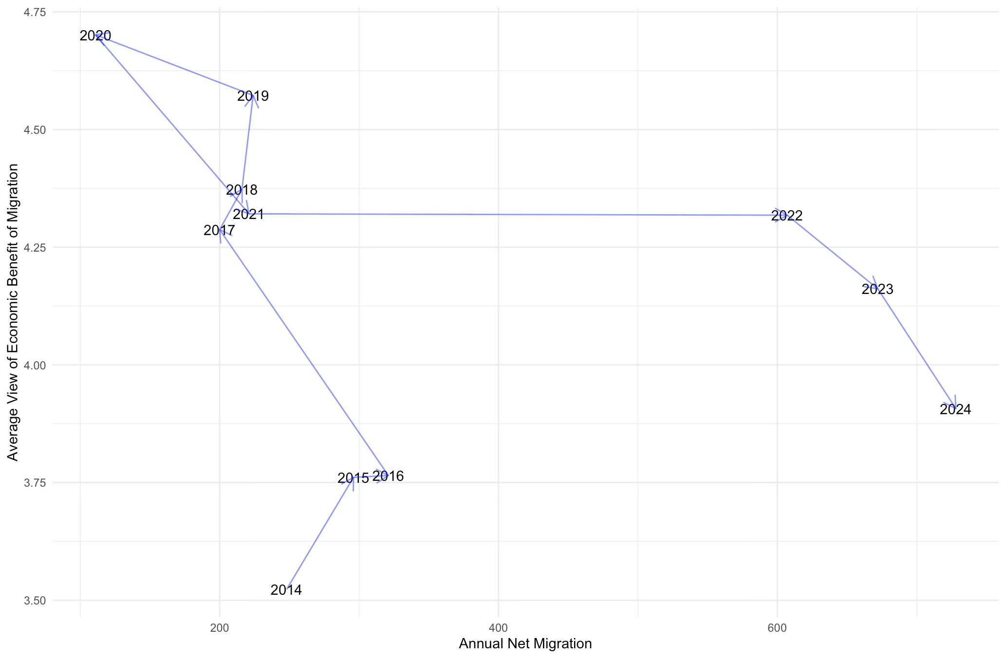
Let’s begin with views about the economic benefits of migration. In 2014 to 2016 when migration was high compared to previous decades, the average score was between 3.5 and 3.75. After Brexit promised to - and to some small extent did - lower net migration, views of the economic benefits of immigration sky-rocketed - up to nearly 4.75 by 2020. That’s an enormous shift for an average on a seven point scale. And neither it nor the lower rate of net migration was sustainable. As net migration surged in 2022, views about its economic benefits were stable but in the following two years of sustained immigration they have declined again, back almost to where they were in 2016 - the year immigration politics gave us Brexit.
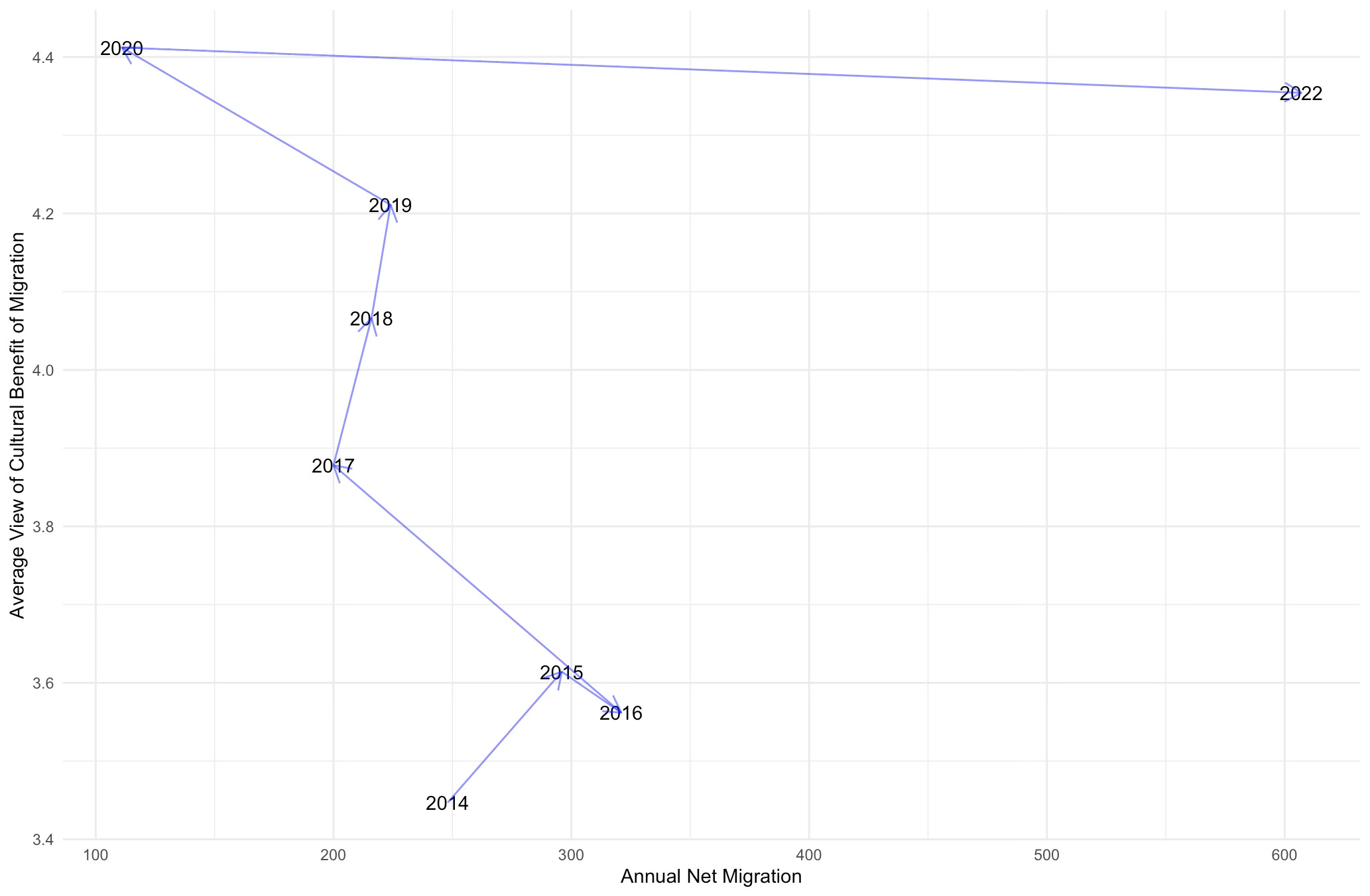
There is a somewhat similar story with the perceived cultural benefits of immigration, though unfortunately we lack data post 2022 to see if the expected drop off happens.
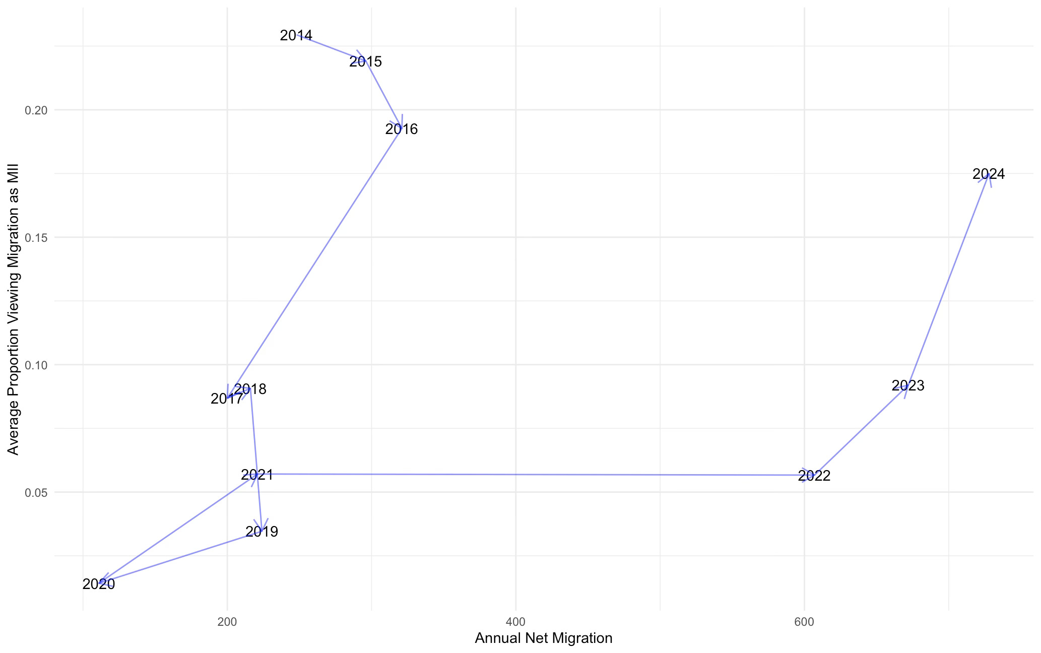
Fortunately we do have data for 2023 and 2024 for the remaining questions. In terms of the ‘most important issue’, between 2014 and 2016 around a fifth of the population thought immigration was the most important issue facing the country. This collapsed post-Brexit to under five percent by 2019. Obviously it was even lower in 2020 when I think we can all agree something ‘more important’ was actually happening. But as net migration numbers have risen, so has immigration’s perceived political importance. Again there has been a lag. No movement in 2022 but by 2024, we were back up to around a sixth of the population seeing immigration as Britain’s most important issue.
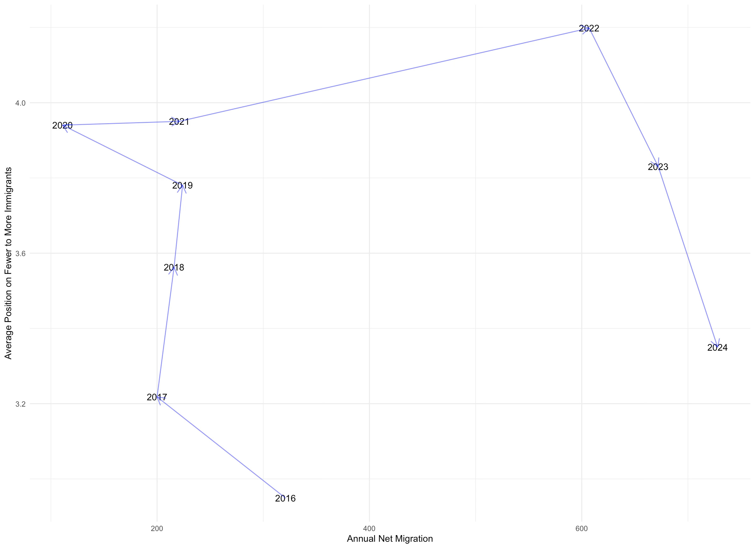
Finally, we have preferences about having fewer or more immigrants. Unfortunately our data only starts in 2016 here, but you can see that this year was the period in our data where people wanted the fewer new immigrants. After Brexit people became more supportive of higher numbers of immigrants. Indeed, 2022 has the peak level of support for new migrants, with an average score of 4.2 - dangerously close to the indifference level of 5, though of course still on average towards fewer. As numbers have surged, support for having more immigrants has plummeted, back down to 2017 levels by 2024.
So, there’s our simple first story. In 2014-2016, when numbers had reached a (then) record high, attitudes towards immigration were quite negative, producing UKIP’s 12.6% vote share in the 2015 General Election and then Brexit. Afterwards as the perception and reality of net migration eased off, support for immigration increased substantially. And as we have entered the post-2022 era of really high immigration, public opinion has reacted thermostatically by becoming more anti-immigration.
This is just basic politics. We see this kind of thermostatic effect in lots of domains - most obviously public spending, where people demand more of it in when the Conservatives are in office and less of it after Labour have been in for a while.
But it’s worth noting that the thermostatic effect has shifted to the right on the graph. Same slope, different intercept. In other words, if you had tried to predict British attitudes towards immigration in 2022 to 2024 from the data between 2014 and 2021 you would have got it very wrong. You would have had something like fifty or sixty percent of people thinking immigration was the most important issue rather than fifteen or sixteen.
This suggests to me that public opinion expects a different baseline level of immigration now. It’s a little like the way the Philips curve relating inflation and unemployment shifted out during the 1970s. Net migration levels really are extremely high by historical standards in the UK right now and yet public opinion seems to have absorbed quite a bit of this.
Let’s say immigration numbers really do decline as expected to low 300,000s. I don’t think people will react like they would have done to those numbers in 2014 to 2016. I suspect they might in fact move back to levels of public opinion in favour of immigration like those prevailing in 2020 and 2021. So those political parties asking for net zero immigration based on current public opinion might find themselves very out of line with public opinion in a few years. We’ll see…
Stylised Fact Two: People in More Diverse Areas Like Immigration More
Enough for right now on the dynamics of national public opinion. Let’s dive in a little further and look at parliamentary constituencies. I am using the old boundaries (2010-2024) here rather than the newer ones on which the last election was fought because all our survey data is pre the GE2024 election. So if you’re a current MP worried about immigration support in your district… well, email me ;)
We have panel survey data from 2014 to 2024 but data at the constituency level is only measured irregularly by the Census, which means making some choices. First choice is that I am going to use the dreaded ‘non-UK’ born as our measure of the level of immigration in each constituency. As I noted at length last time that does not mean that these people aren’t citizens - 43% of non-UK born residents (including me!) are UK citizens. It means only and exactly what it says - these are people not born in the UK. Are they immigrants? Probably. But you also have people like me born to British parents overseas and then back to living here more or less from infancy. So be careful.
The other thing I am going to do, at least initially, is use the 2011 Census estimates. That’s because the survey data starts in 2014 and so we don’t really want to use 2021 non-UK born data to predict opinions in 2014! But don’t worry we will come to changes between 2011 and 2021 shortly.
Final thing to say about the upcoming figures is I take the (survey-weighted) average of our various immigration questions across all the years in the panel for each constituency. So in other words, the x-axis below is measured in 2011 and the y-axis the average of 2014-2024.
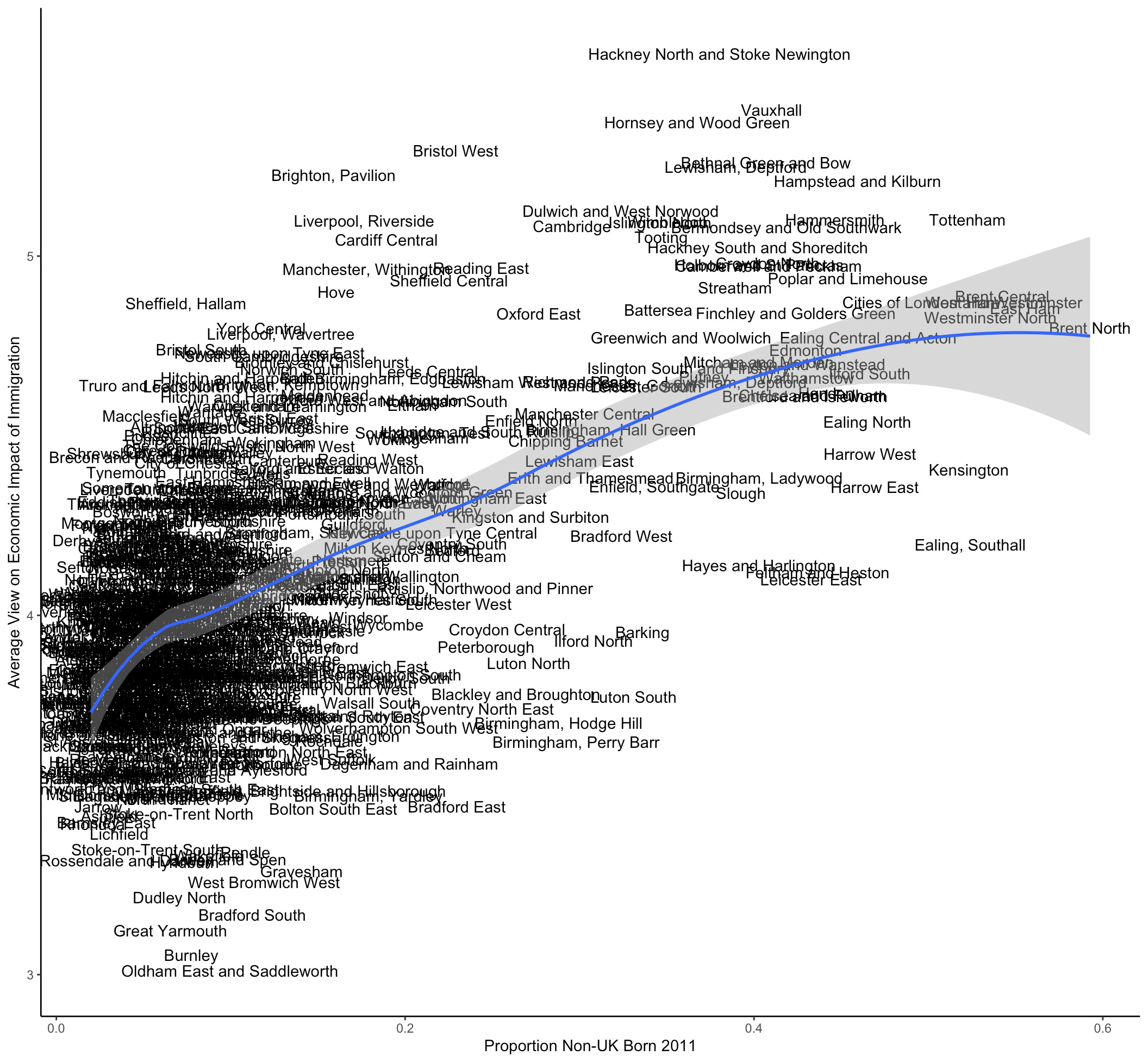
Enough already, let’s get on with it. First off we have non-UK population against the average constituency-level view of the economic benefits of immigration. I have also added a fitted curve to show you the relationship. It’s pretty obviously positive. Places with more non-UK born residents tend to be more likely to think immigration is good for the economy. The range across constituencies in terms of average responses goes from 3 in Great Yarmouth (represented by that fan of mass deportation Rupert Lowe MP) to just under 6 in Hackney North and Stoke Newington.
Be warned though that there are relatively few observations per constituency so don’t go to town on this - this is not an MRP. Still, this all looks pretty reasonable to my eyes in terms of outliers, with Bristol, Brighton, Liverpool and lots of London constituencies more supportive than would be predicted and Oldham, Bolton, Bradford, much of Birmingham, Leicester and Morgan McSweeney’s old battleground of Barking, much less supportive. We’ll come back to Barking.
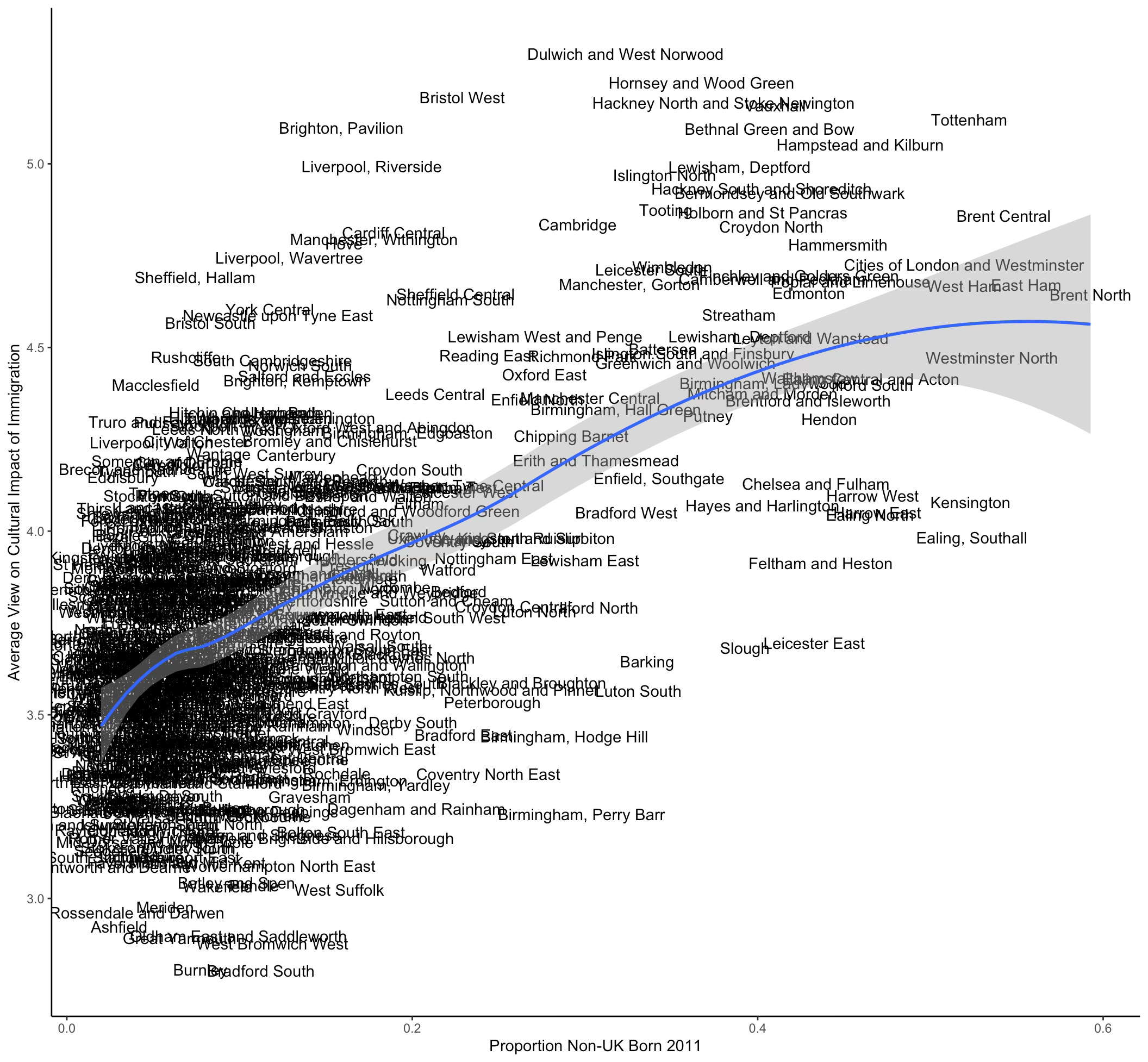
We can do the same procedure for the perceived cultural impact of immigration. It looks roughly the same, albeit with lower average positivity than for economics.
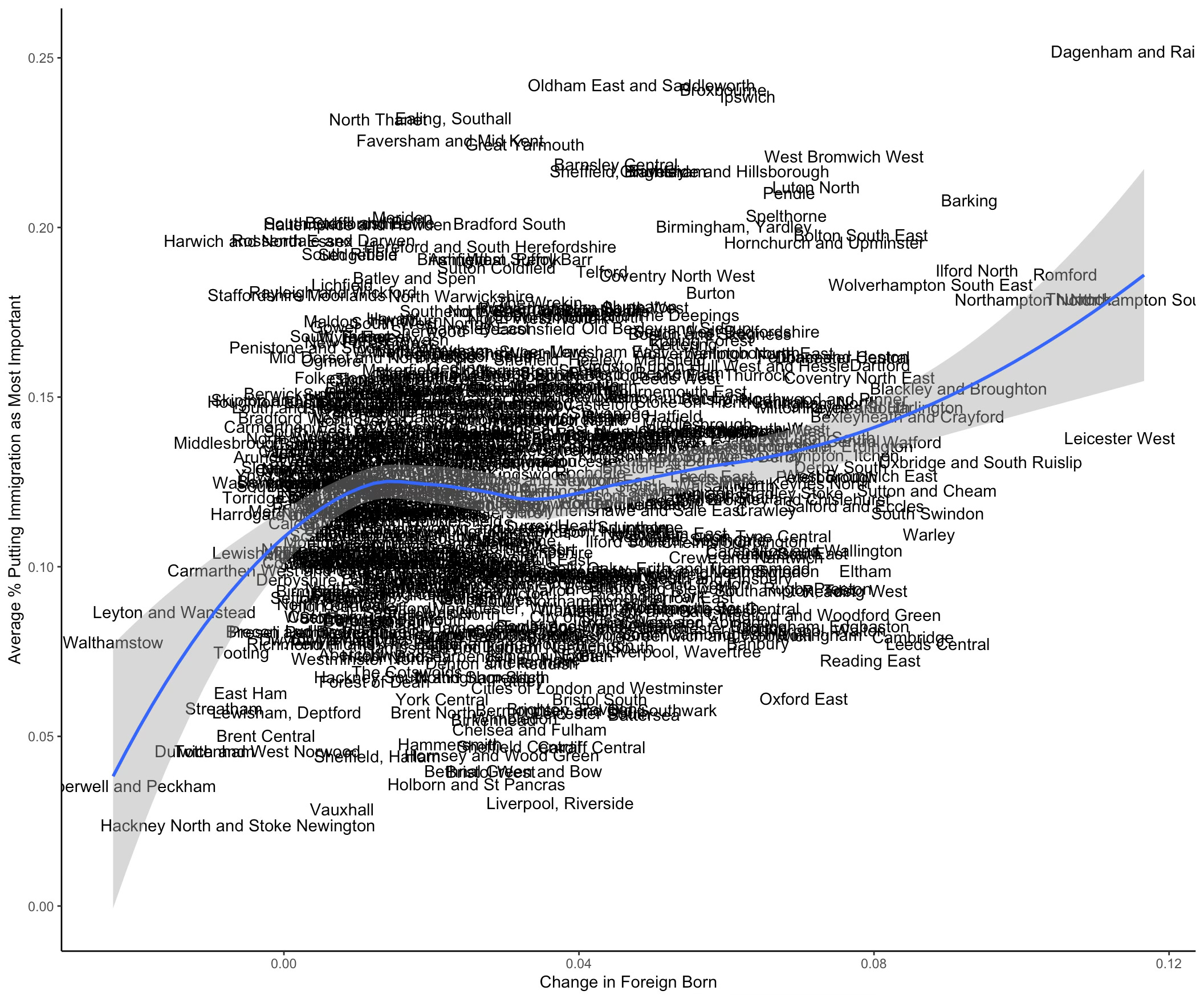
What about the proportion (sorry the graphs says % … oops…) of people putting immigration as the most important issue facing the country? Well now we get a negative slope, albeit one that is less of a tight fit. Not least because of Ealing, Southall sat out there on its lonesome. Other major outliers include Dagenham, Barking (again), Oldham, Ilford, Barnsley and North Kent. By contrast, other than Ealing (!), almost everywhere with high percentages of non-UK born citizens has ten percent or lower in terms of respondents claiming immigration as most important.

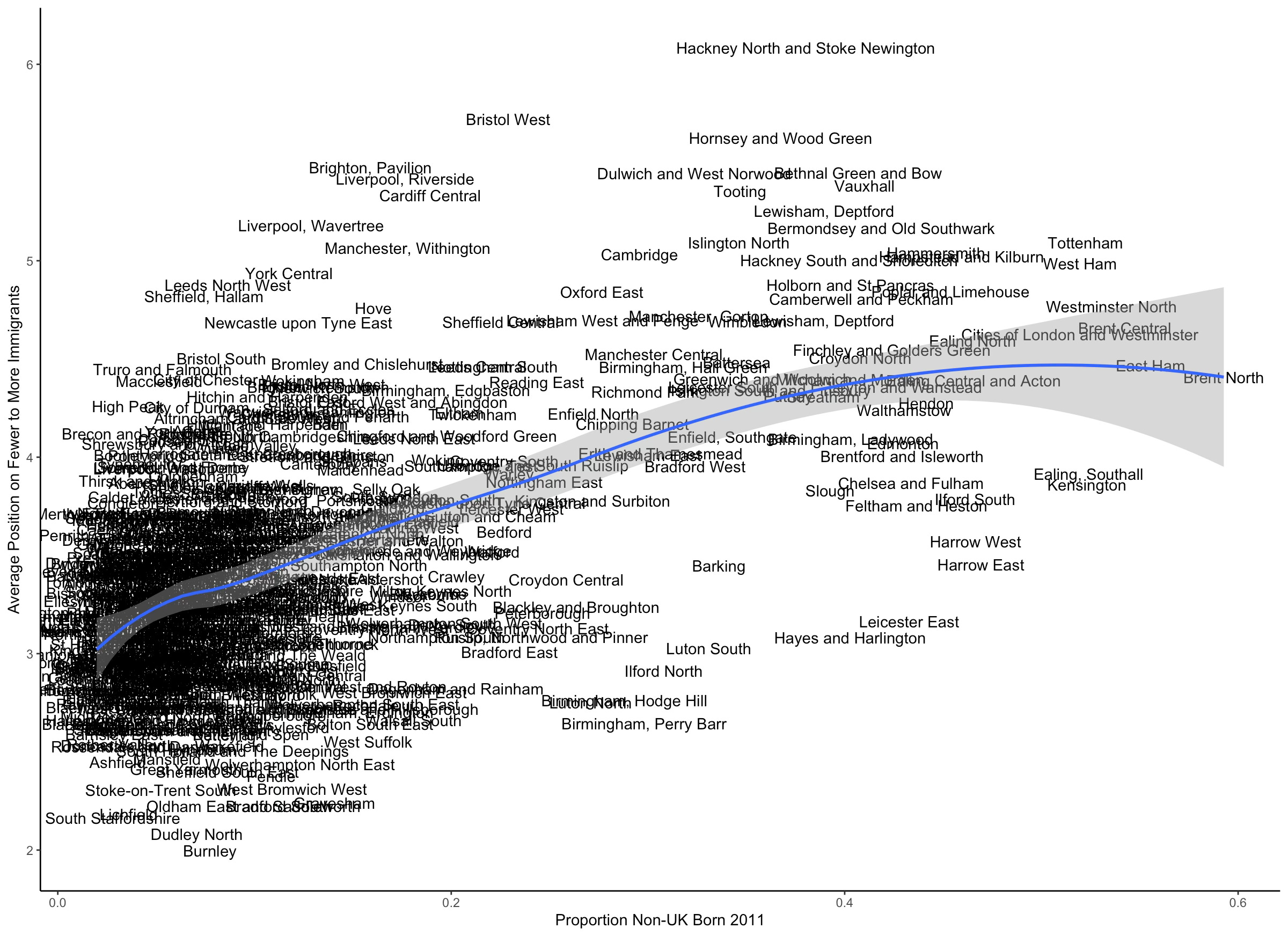
Finally we have preferences over numbers of immigrants. Again a pretty close fit, with places with more non-UK citizens happier to have higher numbers of them. Unsurprisingly, most respondents want fewer migrants on average but there are a couple of dozen places edging into wanting more - the usual suspects in London and large cities. Burnley, Oldham, Stoke and Dudley have the lowest support for new immigrants (and very low numbers of people born outside the UK).
So what’s the story? Basically, the places with more people born outside the UK in 2011 are substantially more supportive of immigration, however we choose to measure it. The overall fit is decent, though least convincing I think with ‘most important issue’ measure, which of course is affected by other issues from the economy to COVID that emerge over the course of the survey panel.
Of course 2011 is a long time ago. If we repeated these graphs with 2021 data they look almost exactly the same but this post is long enough already so I will spare you that.
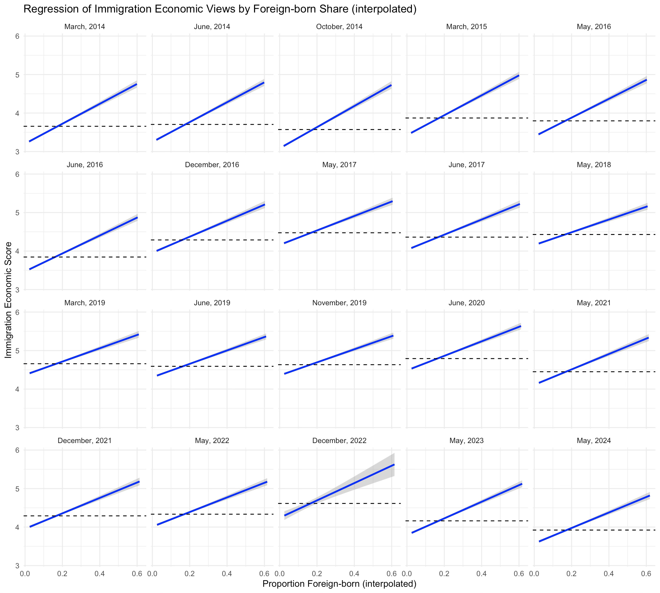
Now you might understandably ask how well these cross-sectional results hold up across all the different survey periods in the British Election Study panel between 2014 and 2024. Well what we can do is interpolate (and mildly) extrapolate the data we have for each constituency in terms of non-UK born for 2011 and 2021 to all the different time periods we have. And then we can look at how these relationships we’ve seen vary across the whole decade.
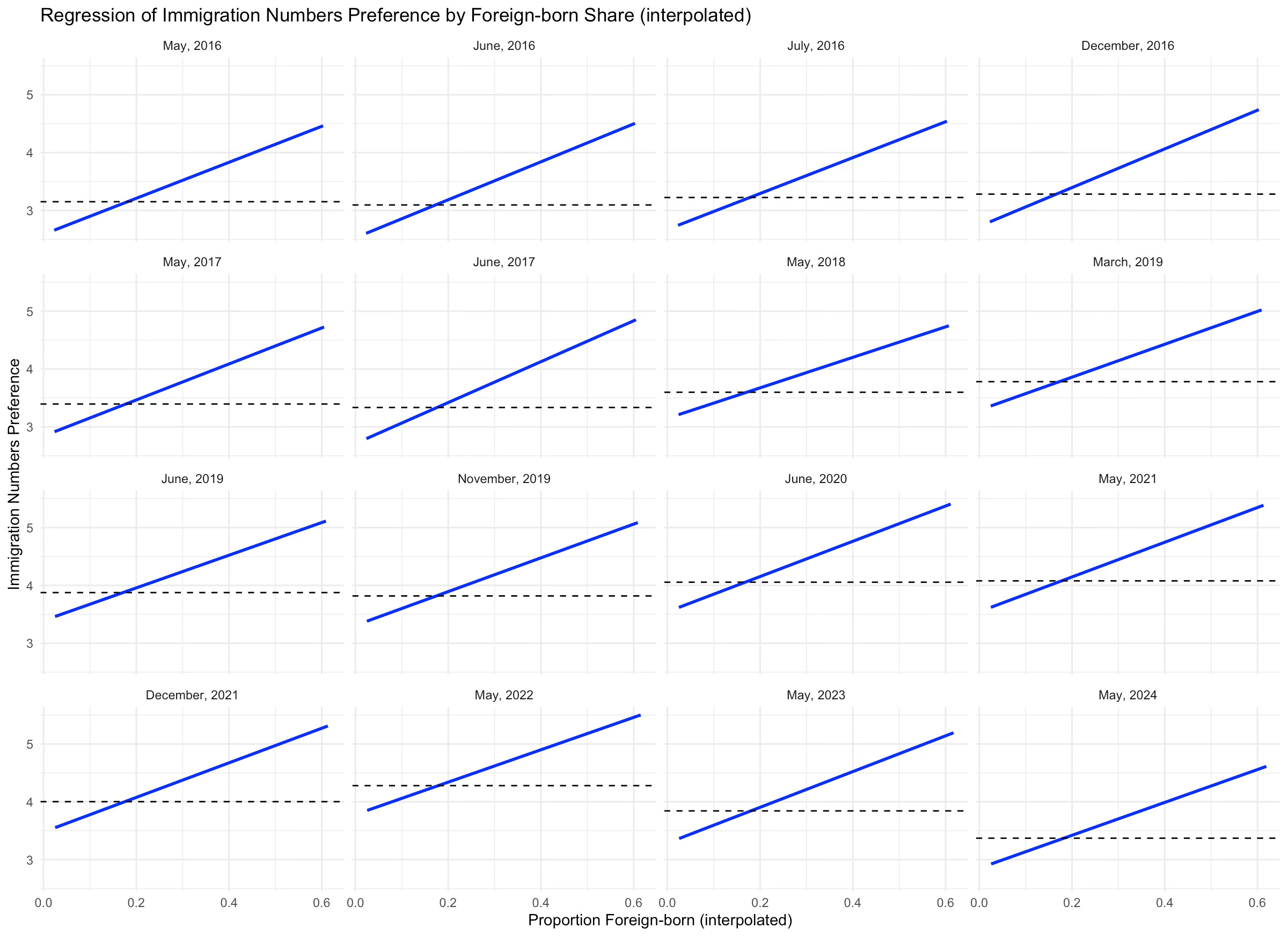
So that’s what I did next. A simple linear regression of each of our four questions on the non-UK measure estimated for each time period (i.e. we have an estimate of the proportion non-UK born for each year). The four graphs below show that relationship and the average answer for each survey (dashed line).
For the economic and cultural questions the relationship looks almost identical in every period. The mean goes up and down in the way we would expect - lower values in the early surveys, rising to a peak in June 2020 and then declining over the past few years. But the basic positive relationship between non-UK born in a constituency and support for immigration holds throughout.

Things are a bit more interesting with the most important issue variable. The relationship between non-UK born and immigration as most important issue is usually negative but post Brexit it’s basically flat until very recently, when it has become quite steep once more. In part that is because the proportion of people who thought immigration was the most important thing in the country understandably got very low during COVID but I don’t think it’s just that. Something about periods of high national migration seems to strongly affect the views of people in the places with the lowest levels of foreign-born citizens. And I think this must be a media effect of some sort, that increases the salience of immigration for people in places without much of it.
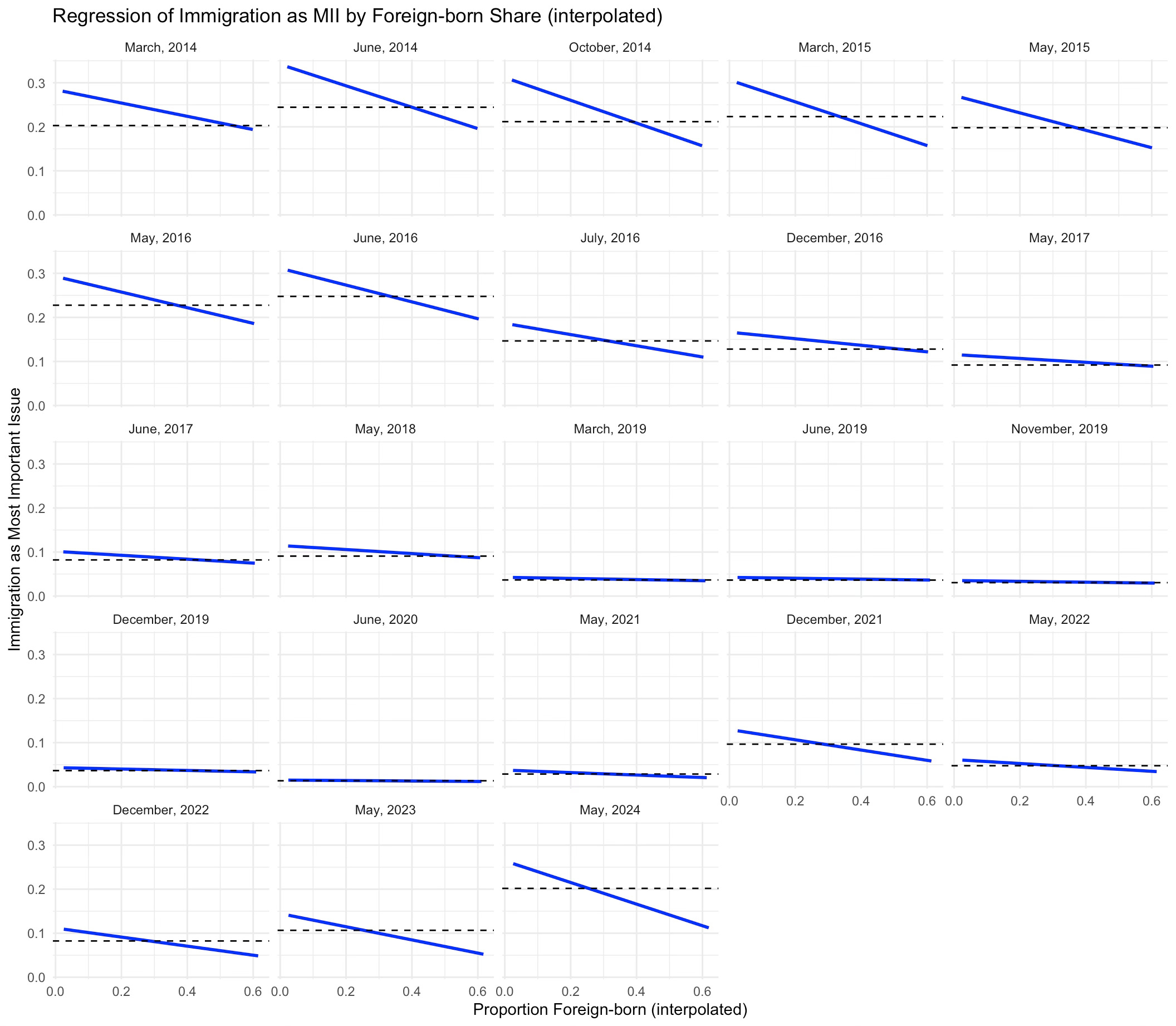
Finally, for immigration numbers we have a very similar result as for economic and cultural impact. The cross-sectional relationship is basically always the same. Given the most important issues result, I find this slightly surprising to be honest.
All in all, lots of evidence that whenever we measure it, or whichever question we use, people in constituencies with more non-UK born residents like immigration more.
Stylised Fact Three: Local Public Support is Thermostatic but only Sort Of
OK so we have seen that higher levels of non-UK born residents seem to be produce more support for immigration. But you might be interested in whether the local change between 2011 and 2021 in the number of non-UK born residents matters.
The things is, changes are a bit hard to think about. Lots of things changed between 2011 and 2021. You might remember them… So we will need to take this carefully.
If we look at cross-sectional plots of average support for immigration against the change at the constituency level in non-UK residents between 2011 and 2021, well we don’t see that much to be honest, at least for three of the questions. But for the most important issue question we do see something that parallels what we found with the national opinion / net migration data - a thermostatic effect. Places with rising numbers of non-UK born citizens do appear to be more likely think migration is the most important issue facing the country.
Notable among such places at the top right of the graph are Dagenham, Ilford, Romford, and yes, there it is again, Barking.
I don’t want to psychoanalyse the current Labour leadership team too much but this was a key location for the foundational myths of Blue Labour and of course where Morgan McSweeney cut his teeth.
One of the reasons Barking is interesting is that relationship between the change between 2011 and 2021 in non-UK residents and the starting level in 2011 is quite unusual looking. It’s basically a hump shape.
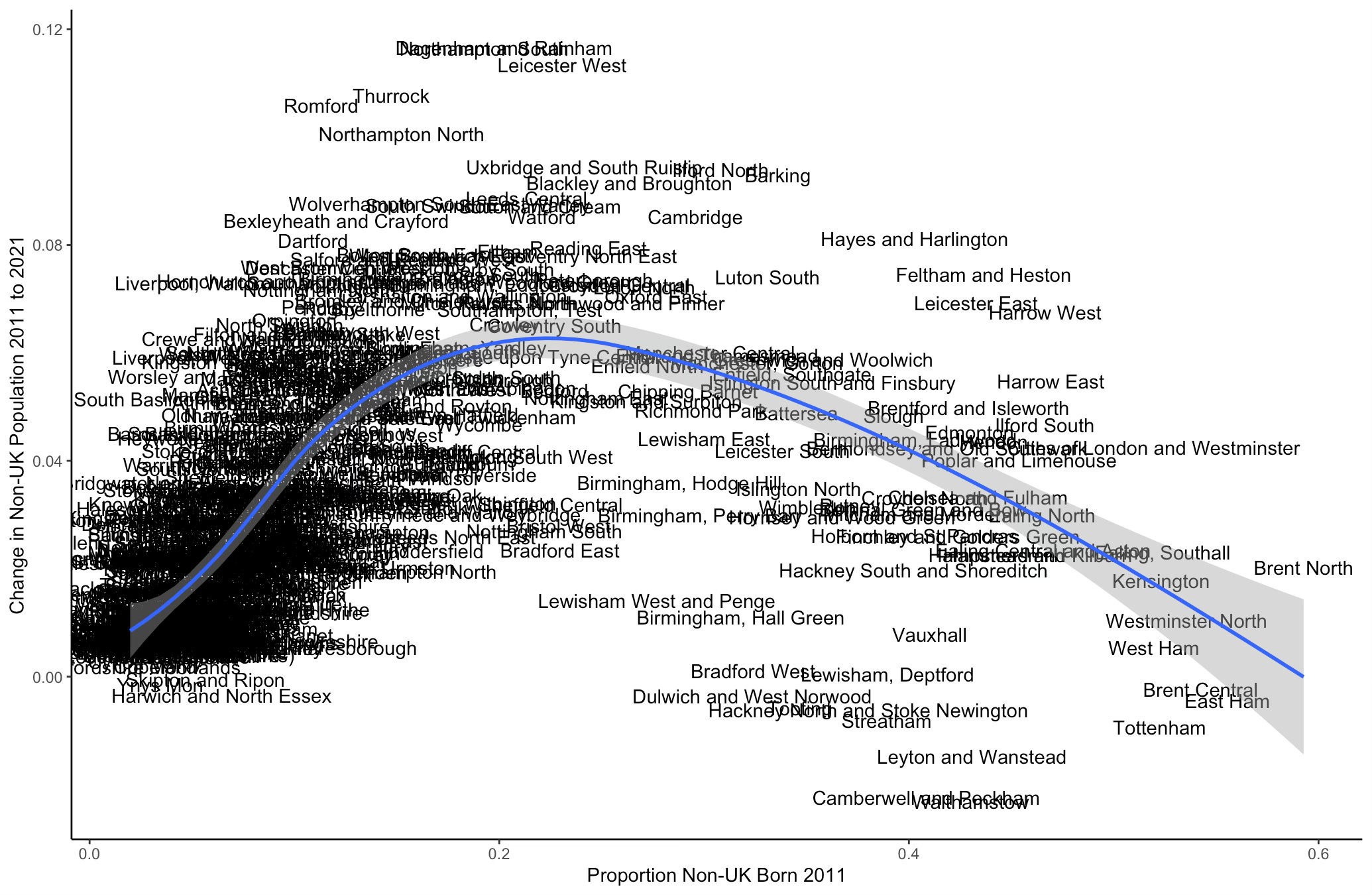
It was places with a moderate level of non-UK born residents in 2011, such as Barking, Thurrock, Leicester, Dagenham, etc, who had the highest increase in absolute terms. So we need to think about how we are going to capture this group that substantially beat the national trend.
And the best way to do that is to use the panel structure of the British Election Study. So far we have been aggregating. At the beginning looking at annual national averages. Then at differences across constituencies. Then constituencies by year. And so finally we are just going to go bananas and look at individuals in the survey themselves.
This dataset has about 250,000 observations so I am not going to plot those. You can take a sigh of relief.
Now breath in again because I am going to do something more horrible and present output from a series of regression models. I’m not actually going to give you tables of coefficient estimates - I’m not a monster - but I am going to show you estimates of the statistical relationship between local levels of immigration and individual responses to the questions. Don’t panic - I’ll explain.
We have a sample with 250,000 observations of almost 64,000 people who enter the panel at various points over the ten years of sampling. Most of these people are surveyed multiple times, in some cases over twenty times (although the average in our data is much closer to four times).1
I start with a baseline linear regression which has the immigration variable question as the outcome (the seven point economics or culture measures, the binary most important issue question, and the zero to ten fewer or more immigrants question) and as predictor variables gender, age, household income, and educational qualifications. And I also include the (linearly interpolated estimate) level of non-UK born residents of their constituency at the time of the survey.
Because different constituencies have different levels of non-UK born residents in any given year, and because the same constituency will have different numbers of non-UK born residents across years, this first model includes local levels and changes.
I then run a second analysis that includes a ‘fixed effect’ for each respondent. What this means is that it only looks at within-person changes in both the answers they give and their characteristics (so I take out gender and age, since year of birth is constant for each respondent). I call this the ‘panel’ model. This second model only includes local changes.
Then, finally, and this is important if we want to think about local thermostatic effects, I add a time trend to the panel model (techie version of this is I include year dummies). What this does is remove from the panel all the national level changes in - well, everything - but in particular for our purposes, national level immigration. This is the ‘panel with trend’ model, which looks at changes in local non-UK born residents, net of changes in national non-UK born residents. This answers the question, what happens if your constituency has a particularly high trend in immigration? As we will see, this makes all the difference.
OK, got that? Hope so. Let’s start with the cultural and economic impacts of immigration questions. The baseline models (without fixed effects) show a positive relationship between local non-UK born population and supportive attitudes about the cultural and economic impact of immigration. This includes both levels of and changes in the local non-UK born population.
In the ‘panel’ models, which look at just within-respondent changes in democraphics and immigration attitudes, we also see a positive relationship. This means that, net of all fixed individual and local characteristics, increases in the non-UK born local population are associated with increases in support for the economic and cultural benefits of immigration. This is positive news for a general ‘contact’ effect - higher levels of local non-UK born population seem to produce higher support for immigration.
But… if we control for national-level trends - in the ‘panel with trends’ model - we find something quite different. Now if your constituency had an increase in non-UK born population above that predicted by national trends, that is associated with you becoming less positive about the economic and cultural effects of immigration. This is Barking calling.

When we look at the other two questions - most important issue and preferred migration numbers - we see a very similar story. For most important issue there is some evidence that higher levels or changes in local non-UK born population make people less likely to say migration is the most important issue facing the country. Except, when we add the cross-time trend this flips, and now places with an above-trend increase in non-UK born residents become more likely to say immigration is the most important issue.
Similarly with preferred migration numbers, levels and changes have a positive impact but changes above the national trend, a negative one.
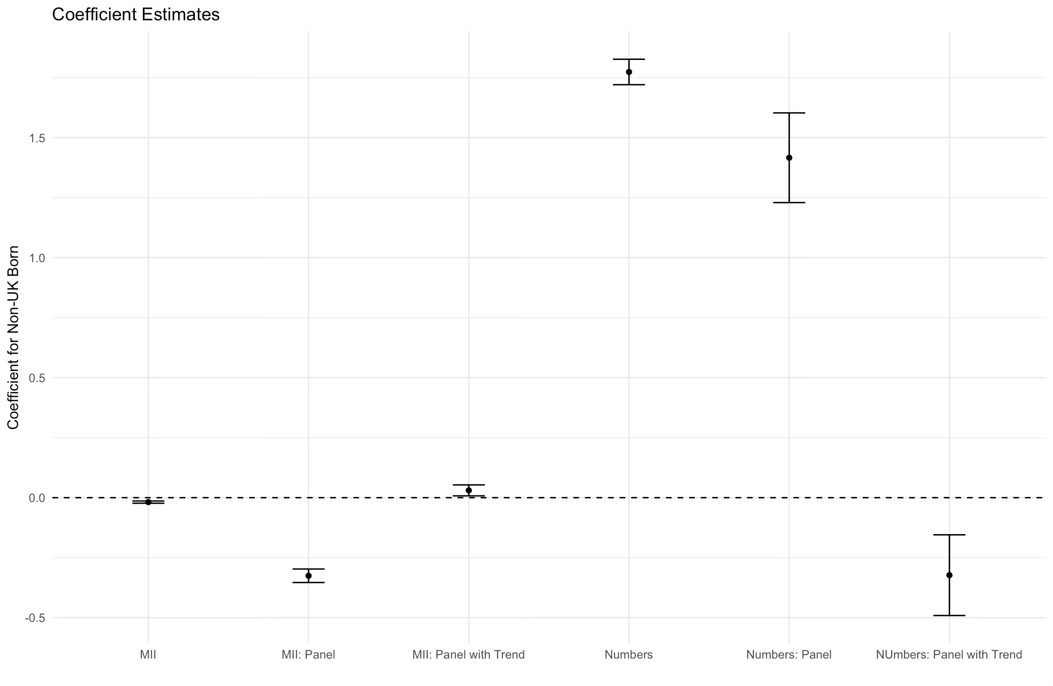
I know this is complex stuff. But it’s important so please eat your spinach for the moment. What we have seen is a mix of Stylised Facts One and Two. We definitely see Stylised Fact Two in the survey data - people who live in more diverse constituencies like immigration more. As non-UK residents increase in number they, perhaps surprisingly, also like immigration more.2 But… if the increase exceeds the national trend, this flips and they like immigration less. So the thermostat holds… sort of… at the local level, giving us Stylised Fact Three
It’s Complicated…
What are we to take from all of this?
Well firstly, levels of and changes in immigration typically push public opinion in the opposite direction. Accordingly, it’s understandable why there is so much speaking past one another in terms of the politics of immigration because the difference between changes and levels is hard for social scientists to get their heads around, let alone the general public, or most of all, politicians.
Second, although the immigration thermostat seems to work at the national and (sort of) local level, the British public today, even with much higher levels of net migration than in 2014, are less opposed to immigration than they were a decade ago. Is that sustainable? Dunno… we will have to wait for the next BES samples to find out. But it perhaps reflects the general trend over decades to more liberal views on immigration among the population. So the thermostatic effect has to contend with that long-run change.
Third, there are some locations in the country with moderate levels of non-UK born residents but high changes in their number that might have particular political salience. Those places include a whole number of constituencies in East London and Essex with connections to major figures on the right of the Labour Party (McSweeney, Streeting) or to Reform UK.
Much of our recent national debate has been led by these two political groupings. And it’s worth noting that they are not making things up - immigration has increased substantially in these areas and these are the areas where that increase has most clearly produced discontent with immigration, at least in this data analysis.
But we need to be careful. These areas, at the top of the hump in the graph above, are not representative of the rest of the country. McSweeneyland is not Britain. By and large, the UK is split into places with either low levels of previous migration, not many new migrants and a generalised distaste for immigration, or with high levels of previous migration, lots of new migrants, and a liking for immigration.
It is absolutely the case that nationally the public will respond to the types of very high immigration we have seen over the past two years by asking for less of it. It is also the case that people in places with lots of current or past immigrants generally like immigration. These are not contradictions. They are just how modern Britain works.
Immigration policy that pretends the country is either adamantly opposed or intensely relaxed about immigration is a fundamental misreading of a much more complex - and interesting - story. Modern Britain is full of contradictions and confusion - it’s not surprising that our views about immigration are similarly schizophrenic.
The question, of course, is how should the government respond to such mixed messages. What is an immigration policy that might work for Britain and that avoids the… um… unexpected consequences of the Boriswave? Told you there would have to be a part three…
Incidentally, all the results below look very similar if we limit the sample to just ‘white British’ respondents - so support for immigration is not being driven by the ethnic composition of the sample or of different constituencies.
This is basically a function of the fact that even though Stylised Fact One seems plausible, the average level of support for immigration over the panel time period has gone up between 2014 and 2024. So while the thermostat works year to year, remember that the relationship has shifted out to the right - that is, the British public seem able to tolerate a higher level of net migration on average than they did a decade ago.
Very enjoyable and illuminating discussion of the nuances of public opinion on immigration in the UK. I would love for Ben to dive into the Caandian data for comparison (though we don't have panel data to offer). https://www.environicsinstitute.org/projects/project-details/canadian-public-opinion-about-immigration-and-refugees---fall-2024
How much of "areas with high levels of immigration are pro immigration" are 1) a bit of a statement of the obvious (e. g. how many people say their presence in a country is bad for it?) and 2) a consequence of immigrants and liberal University graduates both being groups that tend to move to cities?